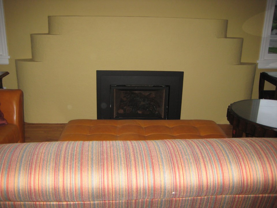
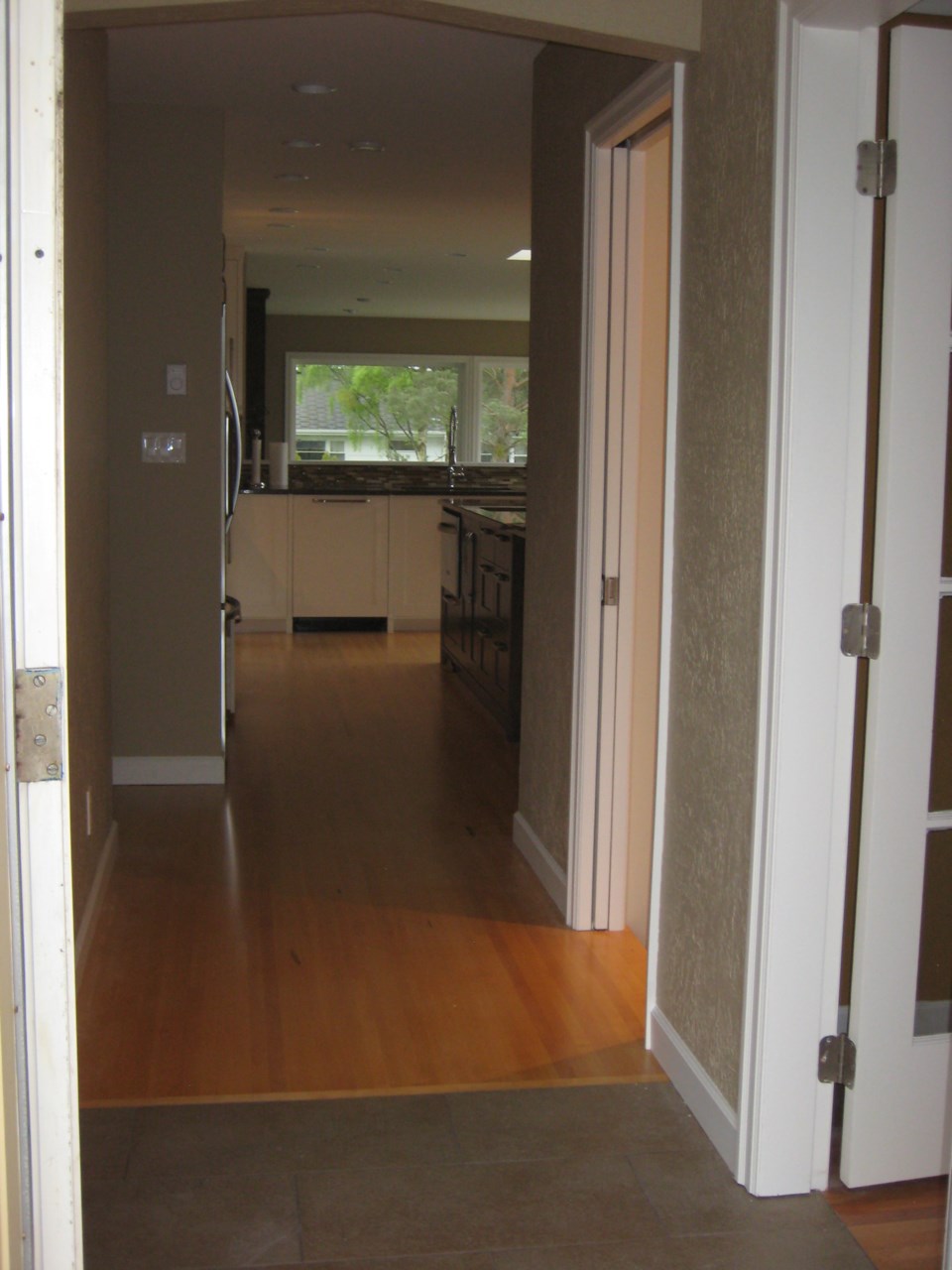
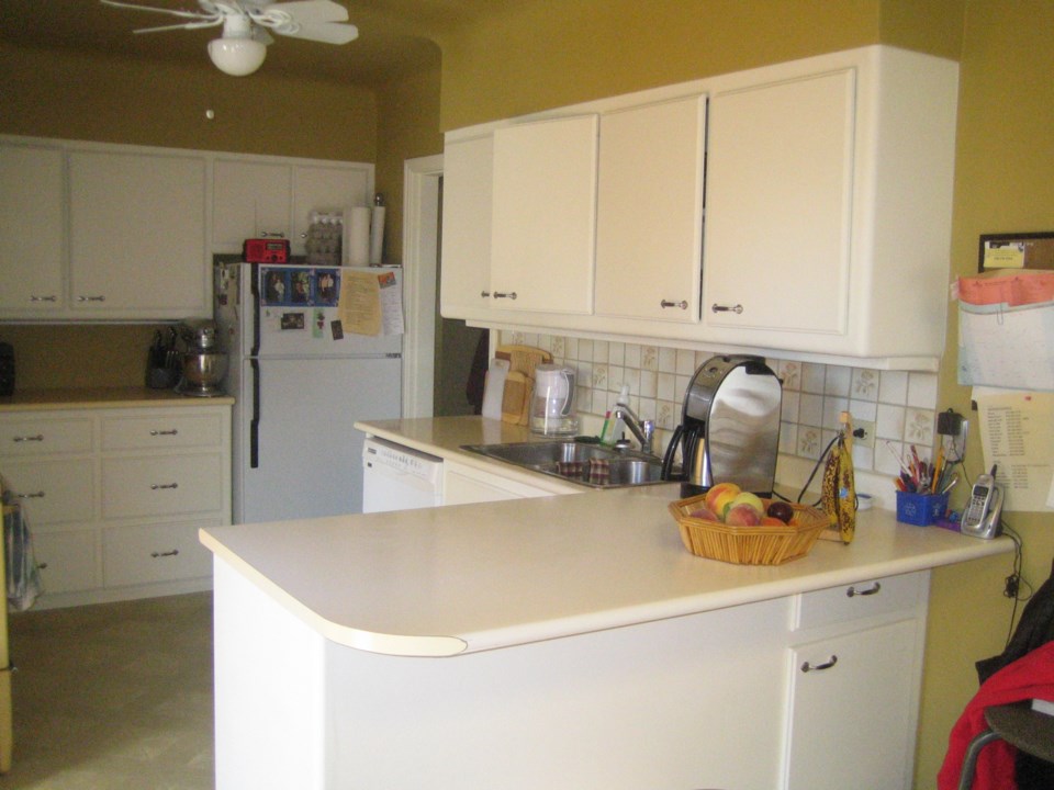
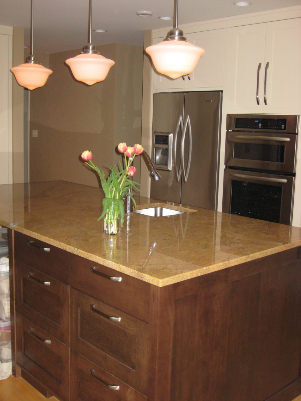
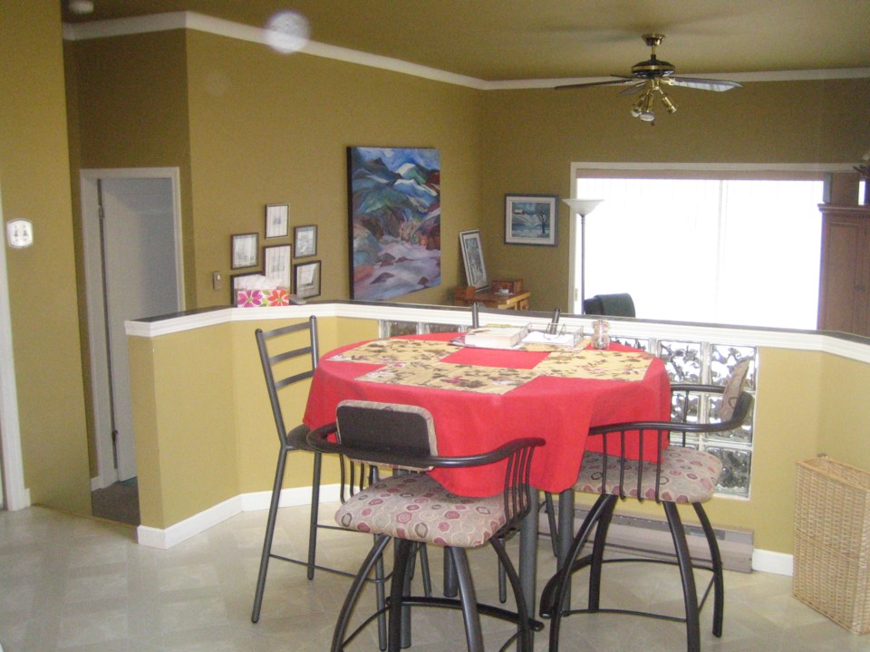
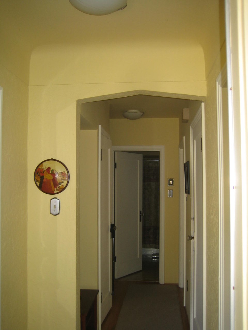
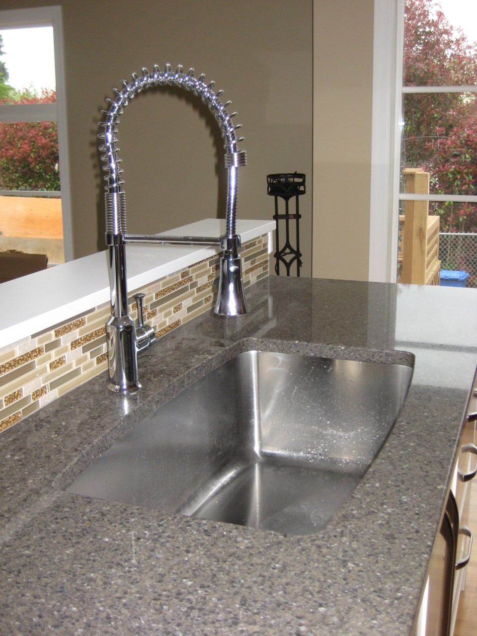
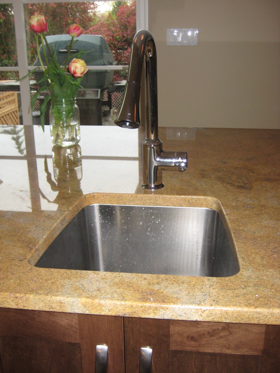
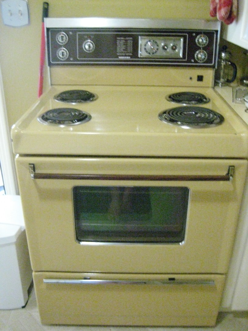
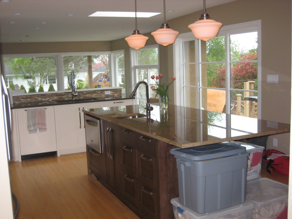
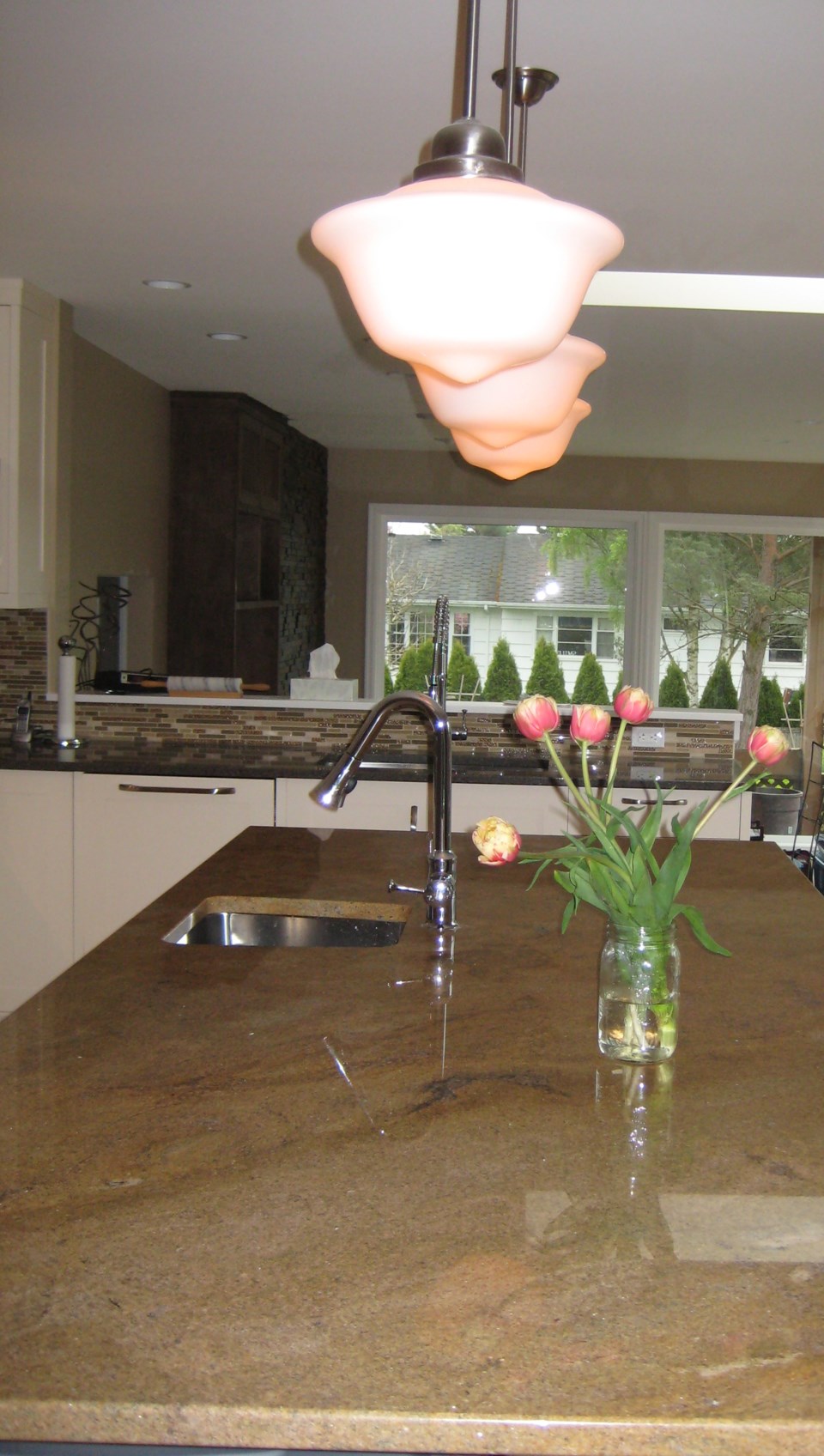
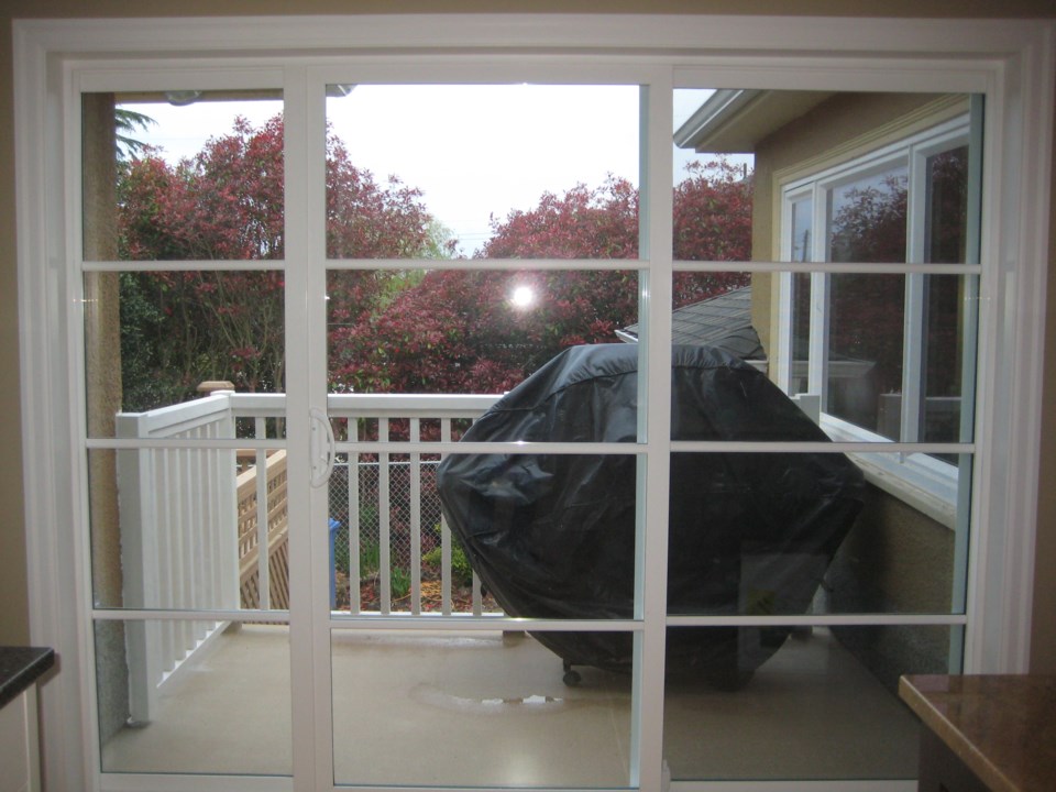
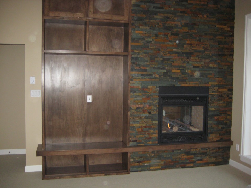
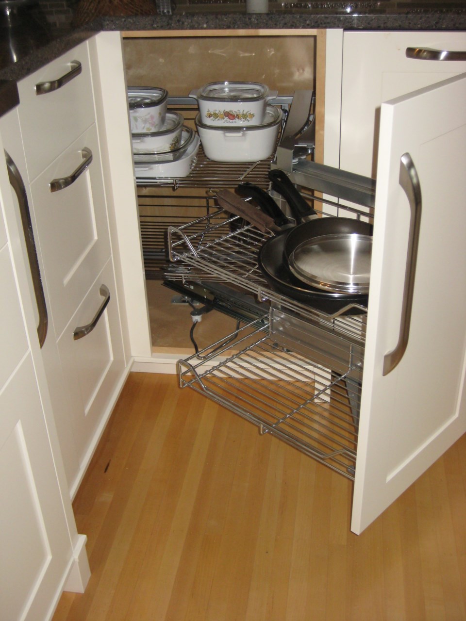
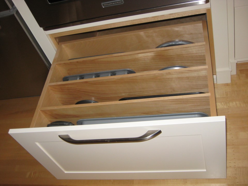
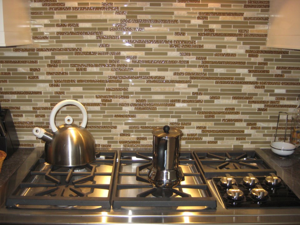
Almost six months to the day that we moved out to an apartment and renovations began, we finally moved back into our house. It's hard to believe it's the same house -- probably because so much has changed. We have a large, modern and efficient kitchen with great flow and tons of storage space. The unusable wood fireplaces are gone, replaced by natural gas models that provide heat at the flick of a switch. The lovely tiles on the bathroom floors are toasty warm, too, thanks to in-floor heating. Big new windows in the family room fill the space with light, which also brightens the adjoining open kitchen. So far, we love everything about it.
Most of our things are still in boxes. We haven't been able to put some things away because there is still work going on in the house. We have been fortunate to have some excellent, meticulous tradespeople work on our house -- we can't say enough about the work of the carpenter, the joiner, the electrician, the tiler and the plumber. The painter? Not so much. The painting process has been excruciatingly slow and sloppy -- and it put behind so many other jobs: Toilets can't go into place until the walls behind them are painted; sames goes for light-switch covers, door handles and other decorative elements. It didn't help that some of the doors had been painted so poorly that they had to be redone.聽 But, in the big scheme of a six-month reno, if one thing has to go wrong, the painting is the one to pick because it's the easiest to fix.
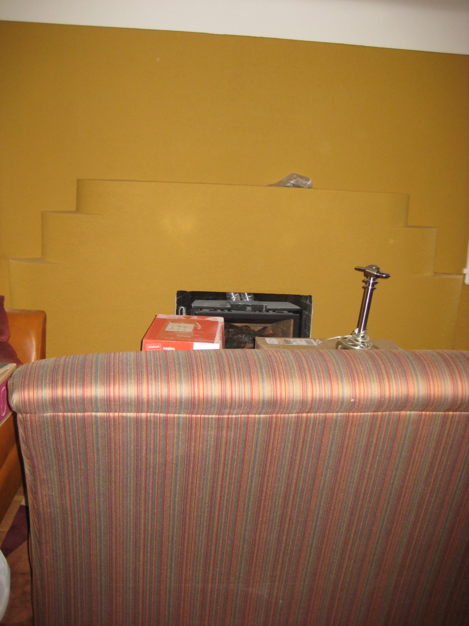
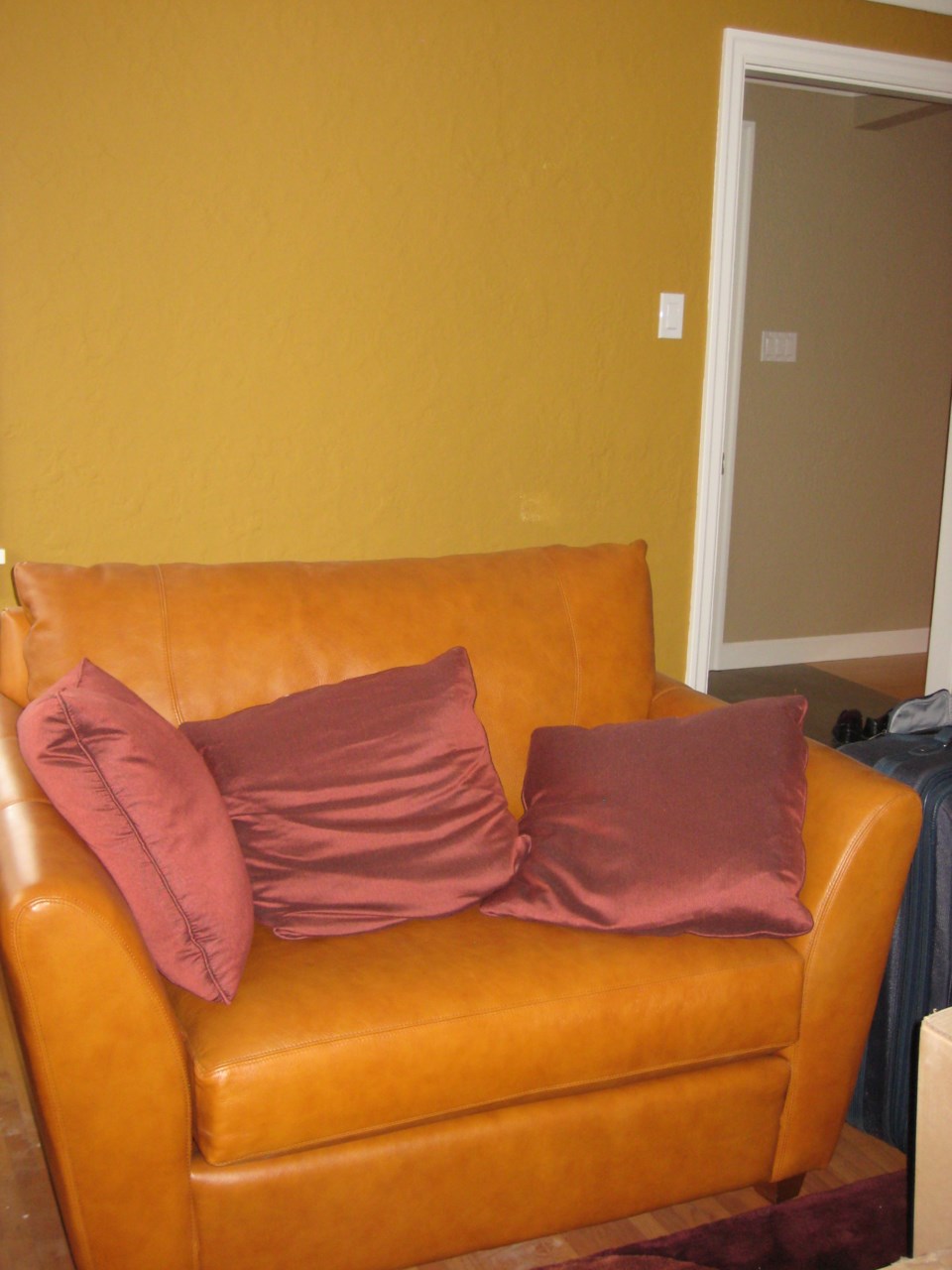
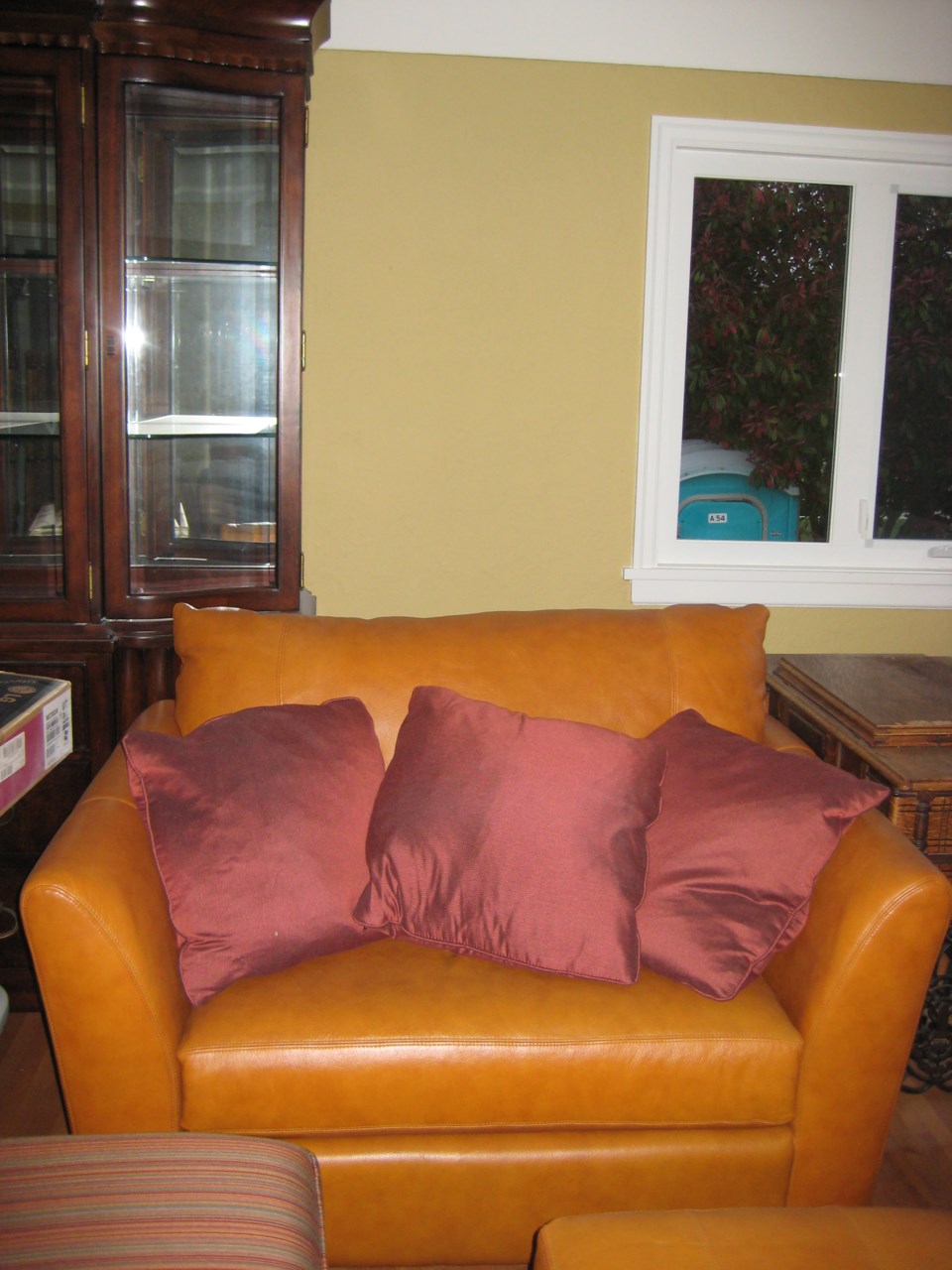
The painting mistake that I wrote about in the last post has been fixed. The colour on the walls in the living and dining rooms was the colour we asked for -- Maple Sugar -- but the wrong brand. It was a very pumpkin orange from Benjamin Moore, but the Maple Sugar we wanted was a more subdued deep golden yellow by Pratt & Lambert that looks very different. The mixup happened at our interior designer's office. Mistakes happen. The wrong colour had been in our renovation design "book" for months and we hadn't noticed. In a small square, it looks like it fits our colour scheme. On the walls, I wasn't not so sure. We decided to wait until the furniture was in the room to make a final decision. Once everything was in the room, it was clear that the wall colour clashed in the worst way. Not only that, the colour itself seemed to scream "Look at me! Look at me! I'm very bright, very bold, very orange." The more we looked at it, the more obnoxious it seemed to become. It was out of step with the calm colours on all the other walls in the house. It had to go.
To her credit, designer Lorin Turner acted quickly to supply the paint and a talented, conscientious and efficient professional painter -- her husband, Robert Turner -- to redo the room in the colour we had originally chosen. Some people had suggested leaving one wall in the other version of Maple Sugar as an accent wall, but it just wouldn't have worked. As Robert said, "It was a mistake. It just needs to be fixed." A wise friend from Ottawa, Becky, who only saw the swatches on my blogpost had the most accurate observation: "I think the lighter colour would make your furniture pop more, give more contrast for Brad and reflect any natural light around the room better." True, true, true.
While the bolder orange colour seems to translate better in photos, reality was a different story.
None of the rooms has window coverings yet and some of the rooms remain without furniture. We got rid of both the family room furniture (tired old pieces that my husband Brad and I had in previous lives that needed to be replaced) and the master bedroom furniture (again, from my previous life, and so many pieces that they didn't fit in the room), but that will come. Below are a few photos of what the place looks like so far. I'll update this post with more photos over the next week or so -- in between unpacking. Later, I'll sporadically post more photos as we finish unpacking and start acquiring furniture. Would love to hear what you think. Post a comment or email me at [email protected].
Thanks for coming along on our renovation adventure.
[caption id="attachment_6217" align="alignleft" width="225" caption="BEFORE: Entry hall
